NOTTINGHAMSHIRE PRIDE
THE BRIEF:
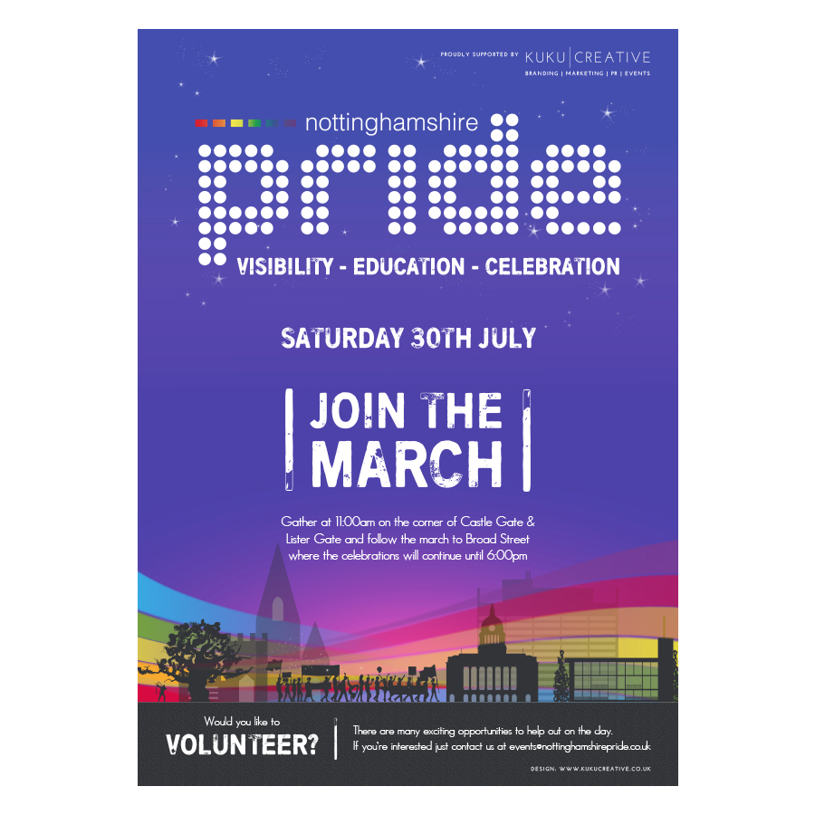
To refresh their existing logo and launch an exciting and fresh new brand with more of an “edgy” feel.
THE SOLUTION:
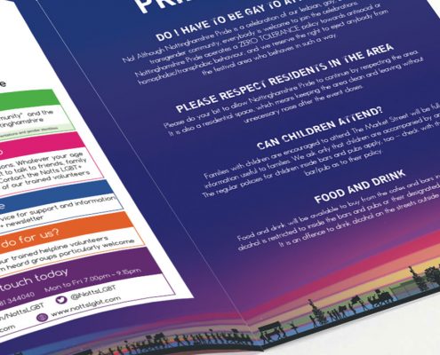
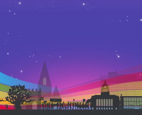
Telling a story with a silhouette we captured the essence of a Pride March whilst representing different Nottinghamshire landmarks. A strong purple and bold, urban font were chosen to portray a feeling of youth, confidence and strength.
FEEDBACK:
“It’s just what we’ve been waiting for and wanted!”
